“To comply with my non-disclosure agreement, I have omitted confidential information in this case study. The information in this case study is my own and does not necessarily reflect the views of Adobe.”
Redesigned web meeting client
My Role
As my first engagement @Adobe, I was responsible for end to end UX for Adobe Connect. Being the only designer in the team, my role was to establish future vision for the product's user experience and work with the product engineering team to get the last level of experience details right.
Awards
In recognition of my work, I was awarded with the "KUDOS" award by the design leadership at Adobe Design India.
Background
Adobe Connect is a web conferencing software which offers immersive online meeting experiences for collaboration, virtual classrooms and large scale webinars. The product is entirely Adobe Flash based.
Over time, significant speculation was brewing on the influences that HTML5 and webrtc will have on the web conferencing space. Increasing numbers of browsers started blocking Flash Content which affected the experience of our users trying to access meetings through browsers.
Our goal was to create a device agnostic HTML5 mobile meeting client for web browsers. As a team, we were committed to support HTML5 which would help us solve some of the important challenges of delivering more efficient and slicker audio-video applications within a browser without the need of any additional plug-ins or downloads, and allowing users to access their meetings across multiple browsers and devices.
Design Challenges
Connect is committed to not forcing customers into a scenario where they must choose between migrating to a new application or losing features just for the sake of moving forward.
The design of Connect HTML5 Meeting client wasn’t about starting from scratch as much as re-looking into the visual language of the Flash client and enhancing core user workflows like meeting joining, in-meeting experience etc. One of the biggest challenges while designing the html5 meeting client was to allow the host of the meeting to control meeting experience simultaneously for participants on both Flash client and on proposed HTML5 client.
The underlying idea of connect meetings is the fact that host drives the meeting experience for all the participants. Which essentially means, (just like a physical setting of a classroom) all layout changes the host does to her meeting room are reflected for all the participants . The key element when you think about Adobe Connect meeting client UI are the “Pods”. If the host decides to bring in a chat pod on the right of the video she is sharing, the pod will appear at the exact same time and location for all the participants. The participants have negligible control on the layouts and meeting experience.
As the host is conducting the meeting on a Flash client, the basic UI structure for the HTML5 meeting client had to be preserved.
Also it was imperative for the HTML5 client design to honor the already existing brand customizations including the aspect ratios of the used artwork/images. It also allowed us to resonate with the existing users of adobe connect flash client.
Our goals were to:
1. Create a device agnostic meeting client accessible from all web browsers (with the support for webRTC).
2. Re-imagine core meeting workflows and Redo Meeting UI without changing the core UI structure.
3. Simplify the meeting UI and align the UI to the other Adobe products.
4. Revamp of the pods and make them touch accessible.
5. Design interactions that are easy to learn and maximise communication
Journey
I started with spending time with the audience who use web conferencing clients like Adobe Connect to collaborate online, get to know and understand their behavior. Tried to understand the shortcomings of the connect flash client. Then, starting from simple paper sketches, advancing through various wireframes and design explorations to high fidelity mocks with motion prototypes I produced design solutions. At every stage, I reached out to my design team and validated my design decisions to make sure I was on the right track. Because almost everyone in my team was also an actual user of web conferencing products, it proved to be a win-win situation for me as it helped with the early user testing.
Including the product and engineering teams from day zero was the key here. It was really helpful to get the product insights (opportunities and constraints) from the beginning of the project and work closely with the engineers to quickly implement the iterations.
Design Details
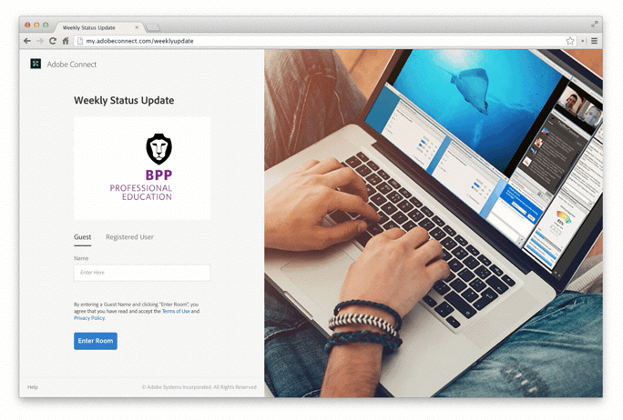
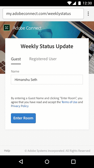
Stronger brand presence on meeting joining pages
Adobe Connect takes great pride in allowing its customers to own their meeting experience by allowing maximum possibilities for branding. We decided to revisit the customization options in meeting joining workflows.
“Banner Images” allows the brands to have a stronger branding footprint.
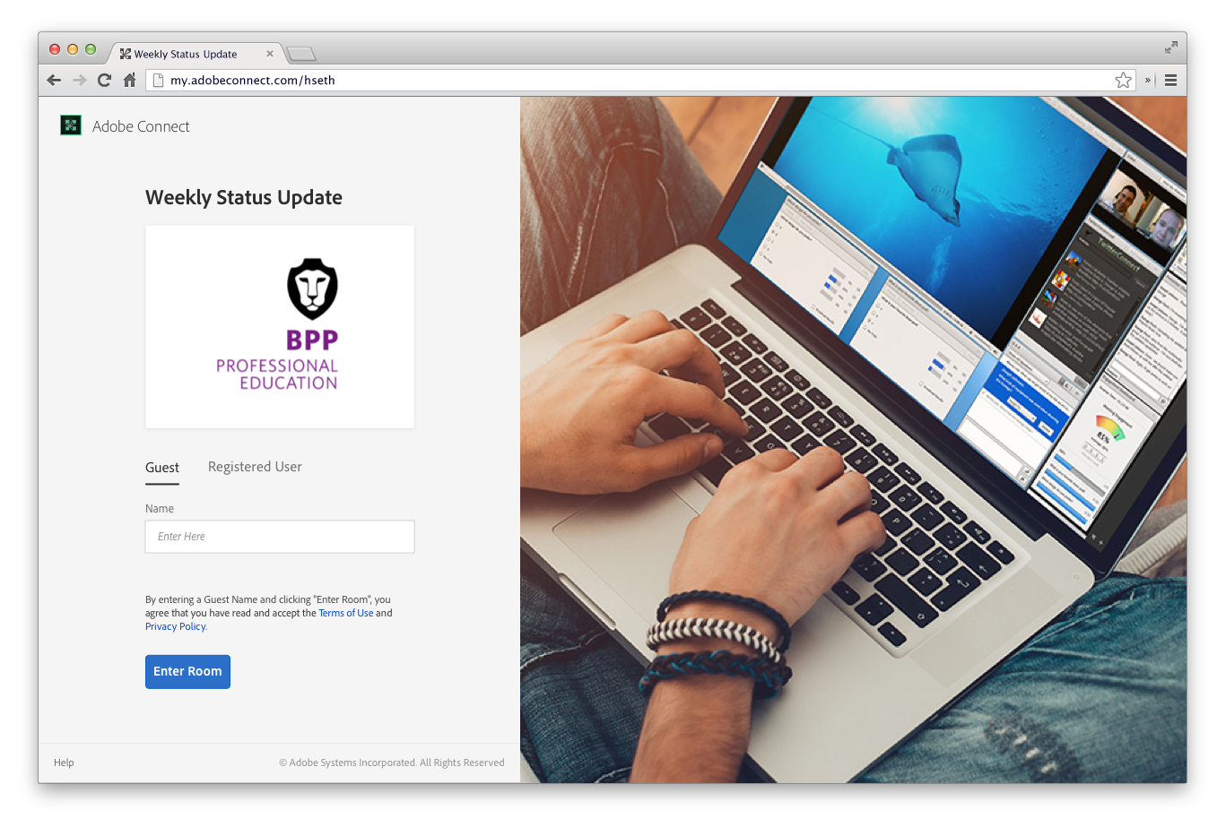
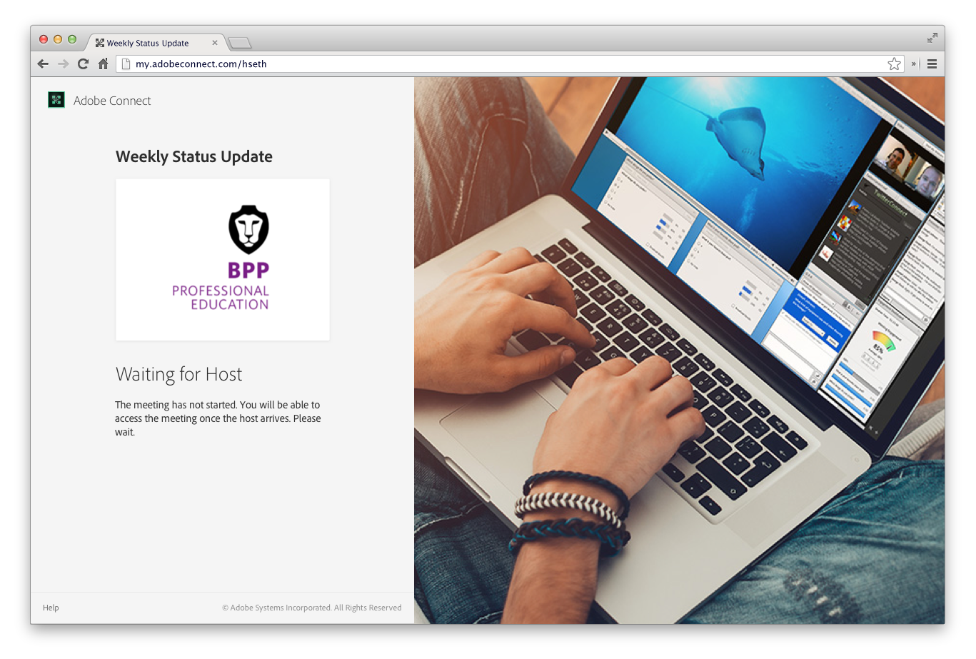
[Left] New login screen with a banner image. [Right] An intermediary message screen asking the user to wait for host to join.
Seamless joining experience
The existing meeting joining experience of Adobe Connect wasn’t seamless. Apart from being poorly designed, the UI changed twice before the participant could join the meeting (make that thrice if the participant landed up on an intermediate “message screen”). This made the meeting joining experience broken and slow. I redesigned the joining experience to make it appear more consistent.
[Left] Old meeting joining experience with UI breaks. [Right] New meeting joining experience with consistent UI.
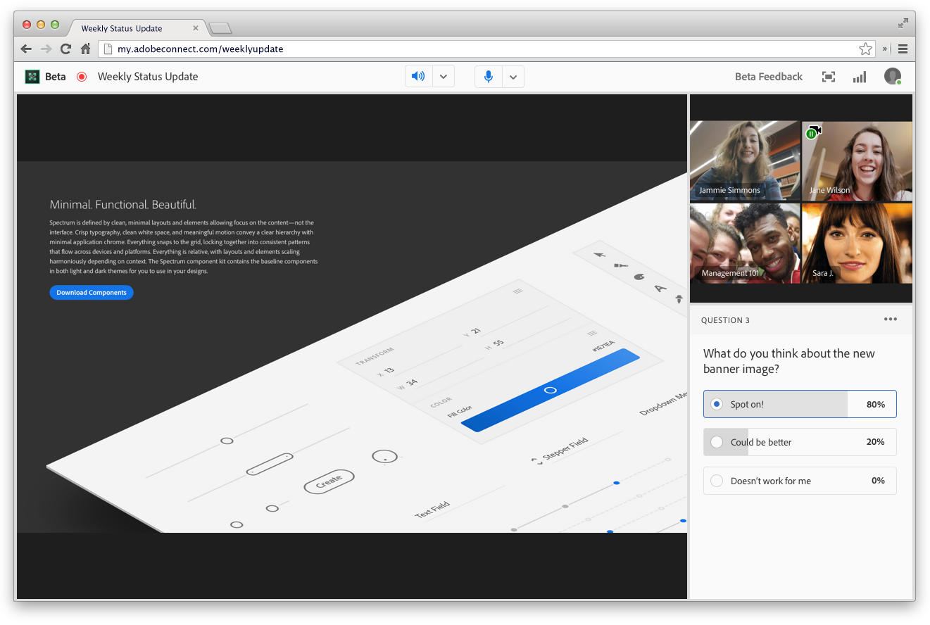
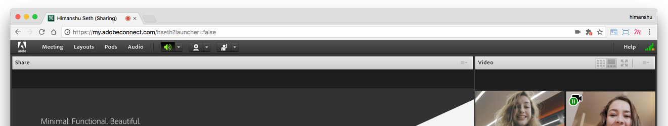
A cleaner and a more “content focused” meeting UI
Online meetings are a time of anxiety, but it need not be. For first time users, the UI should be easy to understand and they should what actions they need to take. The icon/action clusters in the meeting bar were replaced by bringing the most important actions (video and voice) in the focus. Meeting name in meeting bar re-assures the user that they are in the right place and helps reduce anxiety. Recording icon before the meeting name helps to make the UI transparent by letting the users know when they/their activities are being recorded.
Content should be the focus of every meeting. Visual noise was reduced by taking out the heavy pod bars/pod outlines. We gave away with pod shadows and gradients.
Visual language is monochromatic and color is used for meaning instead of decoration.
Meeting UI of the existing, flash meeting client. Heavy pod bars/outlines, persistent pod actions introduced a lot of visual noise
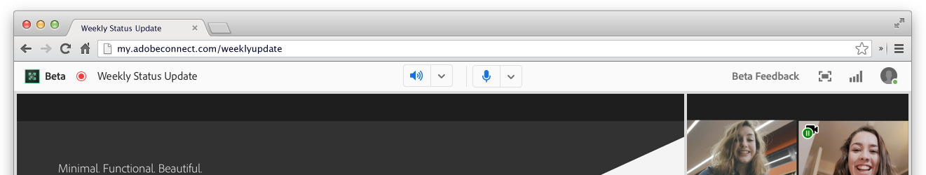
Web meeting client UI. Pods like Share, Video etc. have transient pod bars and are invoked on hover
The navigation in the middle of the meeting header provides the user with quick access to basic/core communication actions like Audio, Video and Microphone. “ON” state of each of the actions is depicted by blue (#1373E6) color. On hover, every icon is supplemented with a tooltip describing the action.
While the left side of the meeting bar provides information about the meeting (brand icon, meeting name, recording status), in the right are the secondary actions. Actions like in-meeting feedback, connection strength, help and access to user options are grouped together away from focus but in-sight of the user.
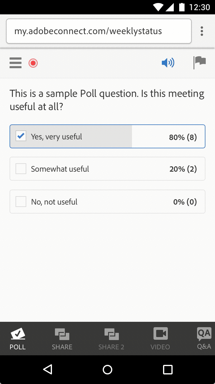
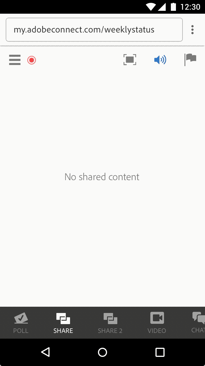
Redesigned/Touch ready Pods
All Pods were redesigned to make them less cluttered and touch accessible. The were designed to highlight content and minimize decoration and visual noise.
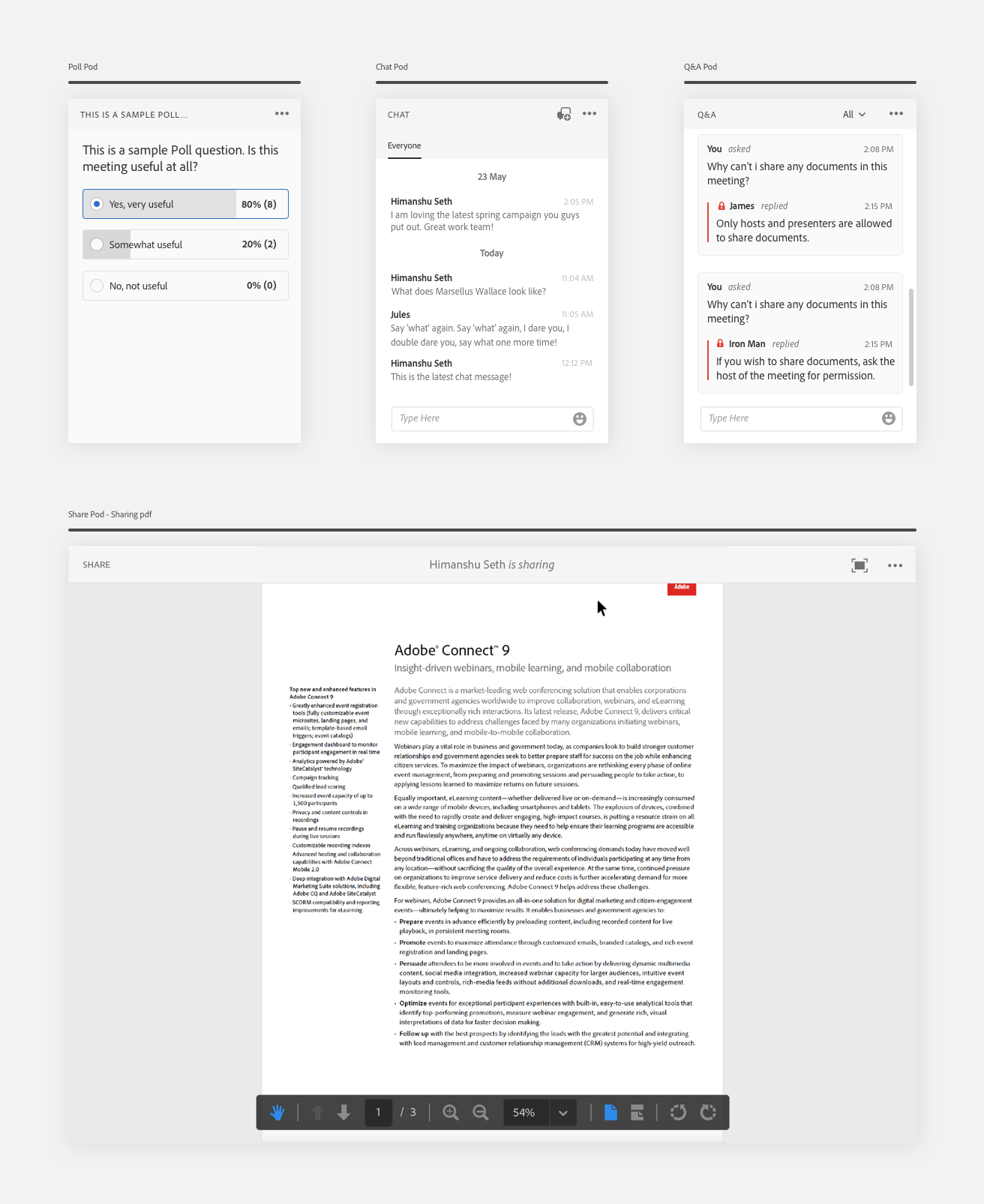
Example of pods in web meeting client
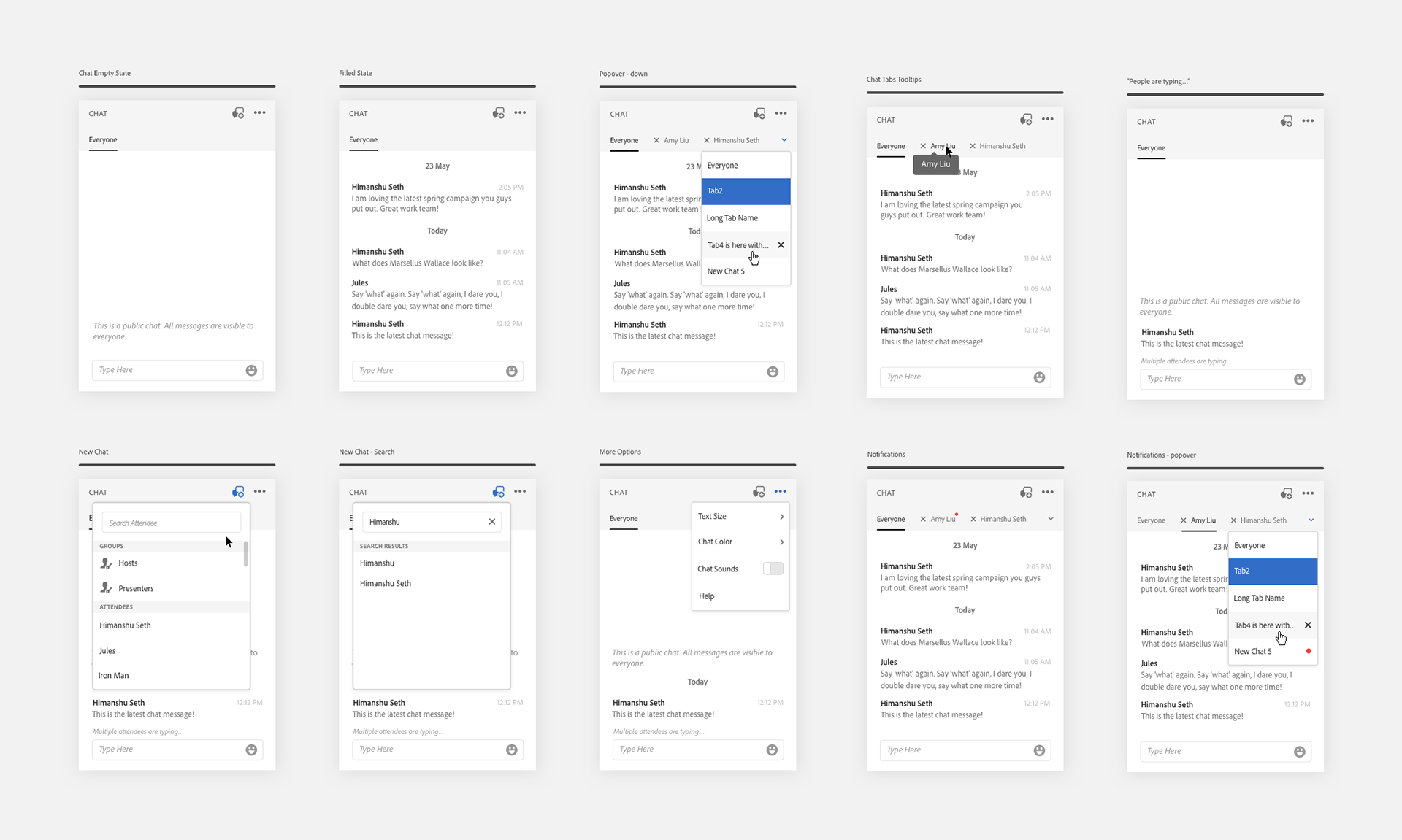
UI states and interactions for chat pod
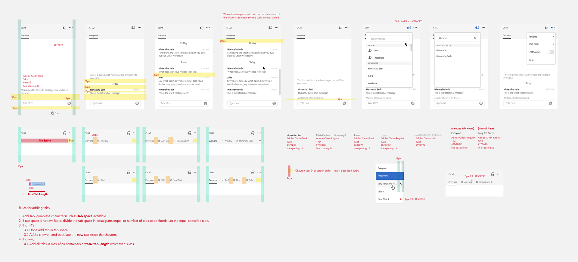
Example of hand-off for specs and rules for UI elements, to engineers
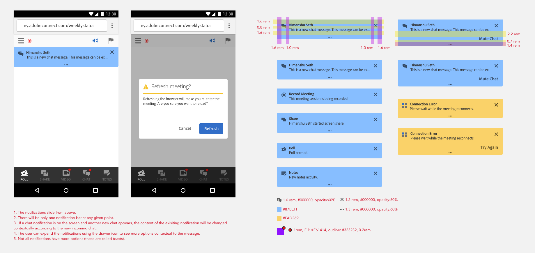
Empty States and notifications
Empty states form a vital part of any web conferencing client. Absence of visual feedback to participants in the meeting can result in anxiety thereby degrading the user experience. This can cause participants to be nervous and make unnecessary mistakes whilst an important discussion.
New empty states make the participants know what to expect from each pod. This can allow them to be prepared to take appropriate actions on the content. In case there is any error with the pod content.
Motion was added to add moments of delight/fun.
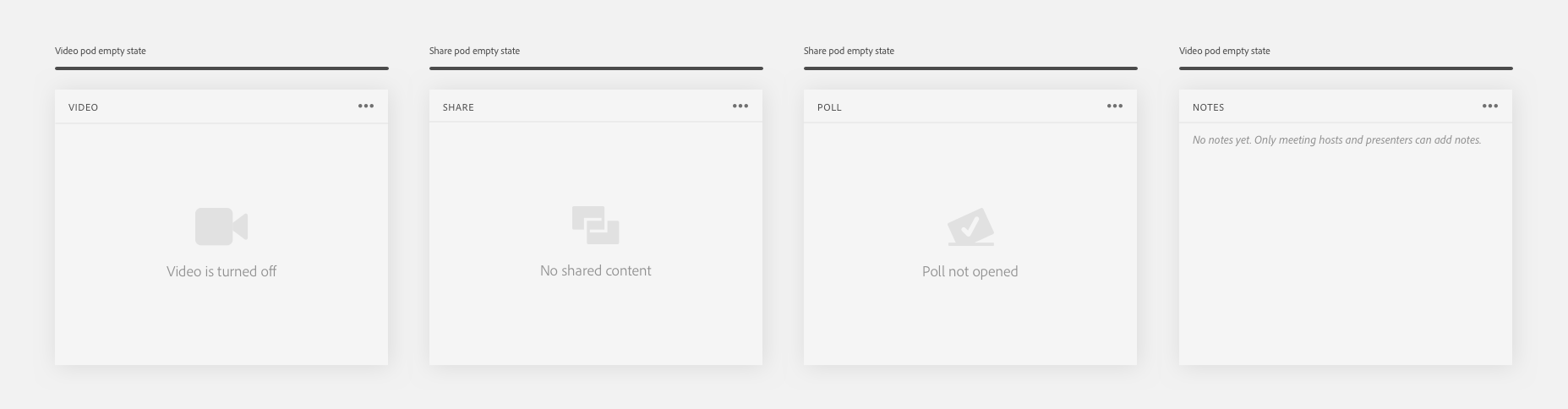
Null states for pods
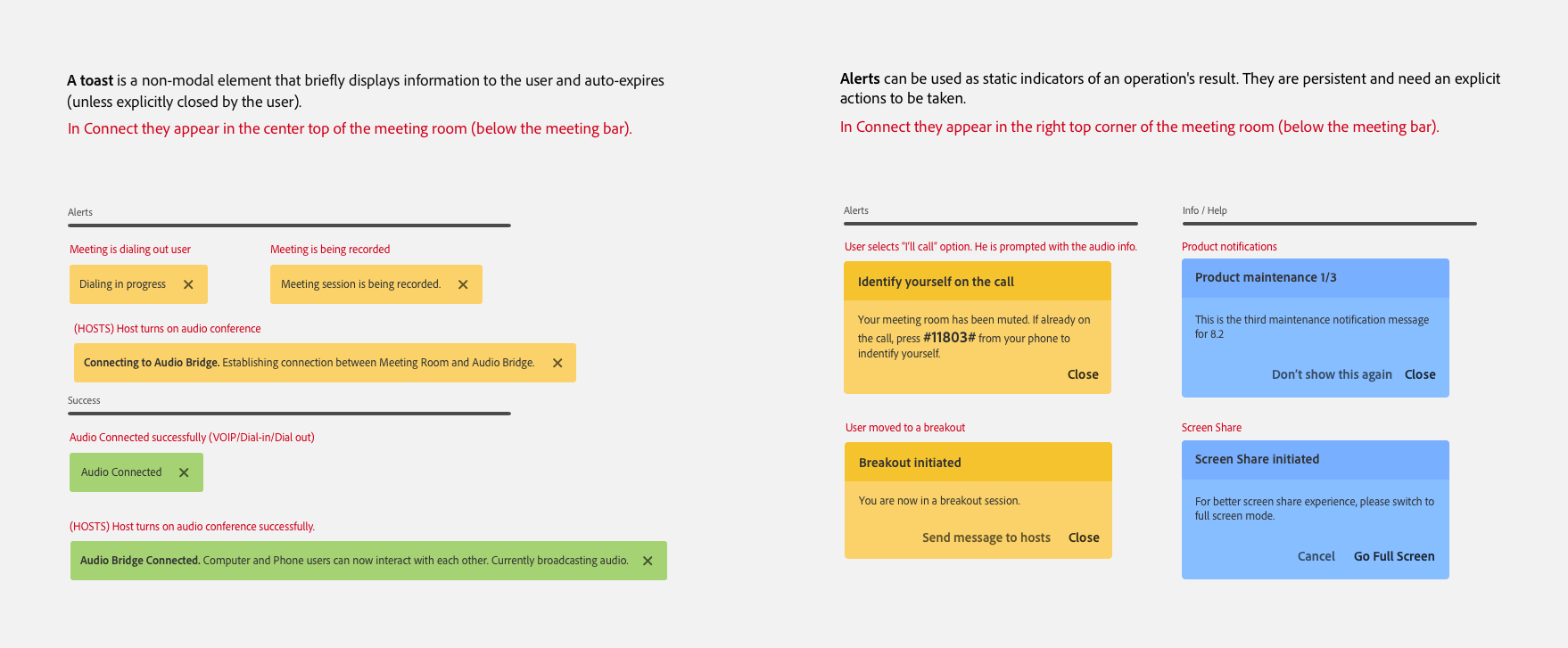
Guidelines defining toasts and notifications for the meeting client
Notifications are used to communicate the status and the exception/error cases.
Notifications without a supporting action (also known as toasts) are used to clearly communicate the status of the user in the meeting. For example, if the meeting is being recorded, the user is notified using a toast which appears and fades away. Whereas notifications with actions are used in cases where an input is required from the user. For example, when screen sharing is started by the host of the meeting, a notification with an action of “Going into full screen” is displayed to the user influencing him to take a particular action for best meeting experience.
Mobile Browsers get one too!
People move between phone, tablet, and web throughout their day, but their meeting experience should be consistent and device agnostic. Downloading Mobile apps to attend meetings is a major deal breaker for infrequent participants, even more when their intention is to be a passive viewer. HTML5 technology allowed us to leverage the code base of desktop client and design an adaptive version for mobile devices.
So with the desktop client, we introduced a mobile meeting client to allow the users to quickly access meetings. Without the need of any App, the participants can simply hit the meeting URL to access their meetings.
Unlike the existing Connect Mobile App, where the default view is a bird eye view of the meeting, the mobile client focuses on one Pod at a time. The priority of pods in the meeting UI is determined by the type of content and activity. So instead of maintaining a fixed hierarchy of pods, the order determined on runtime, based on the activity in the meeting.All the advanced meeting options were tucked inside the hamburger menu.
[Left] Notification specs for mobile view. All meeting messages are classified into two broad categories to enable consistent experience. [Right] Prototype made using Principle to show motion/animation for notifications.
One important design decision here was to go the adaptive route instead of a responsive route. That is, the mobile client would load only if the meeting client is hit from a mobile web browser. Although the desktop meeting client responds to view port size changes from 800px x 600px and above, anything less than this would introduce scroll bars in the view port. This is our way of giving feedback to the participant that we recommend the desktop client UI to be used above certain view port size on desktop.
Motion
Motion plays an integral part of the mobile html meeting experience. A lot of attention was given to use motion to define functionality and relationships between different UI elements. For example the boomerang motion of bottom pod bar on meeting entry helps to communicate the navigation clearly to the user. When the user enters the meeting, the pod bar animates to and fro horizontally to show all available pods in the meeting. Due to limited screen space, it can be overwhelming to show all available pods at once, whereas tucking them inside a "more" option can lead to users completely missing out on certain pods due to mere neglect.
All Animations were designed using Principle App and shared with the engineering team to convey the expected experience.
[Left] Motion of bottom pod bar to communicate navigation to the user on meeting entry. [Right] Animation of share pod from null state to screen sharing. Double tapping on the image zooms in and repeating the gesture zooms out.
My Learnings
Its critical to communicate to your stakeholders. The fact that I was designing a product which has been around for a while, most of the times my designs met with extreme reaction from users and stakeholders. So it was imperative for me to be prepared with design explorations backed with facts and user studies. Its very important to be open to feedback and be inclusive. Also working for a legacy product like Adobe Connect has made me understand that sometimes things take time and its very important to not lose the momentum and be focused throughout.
Another very important lesson I learnt from this project is the importance of engineers in a product design cycle. They form a vital part of a designer’s iterative process. The sooner you bring them onboard the quicker we can iterate designs and test it. Their knowledge of when and how meeting components get loaded helped me to decide right waiting states and transitions in the product.